Graphics
Graphics help to convey comprehensive information in a simple and consistent manner.
Tables help to share a large amount of information in a concise and user-friendly manner. Ideally, they are set up in landscape orientation. Make sure that you retain the overall relation of the elements when scaling the tables up or down.
Points are abbreviated as ‘pt’; typographers and typesetters have traditionally specified a given typesetting as 10/14 pt to indicate 10-point type with 14-point leading.
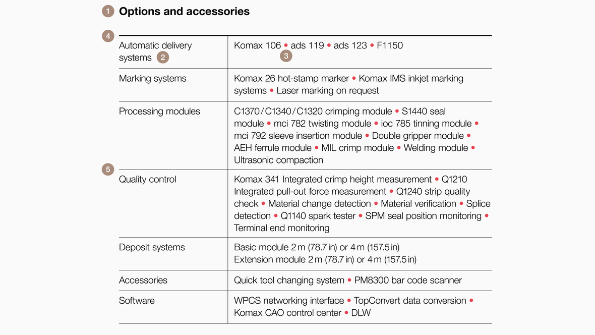
- HeadlineHelvetica Neue Bold, 10/14 pt
- Body textHelvetica Neue Light, 8.5/11 pt
- Separator bulletsHelvetica Neue Light, 8.5/11 pt, red ASCII Code: Alt + 0149
- Top line 1 pt solid, black
- Separating lines0.25 pt solid, black
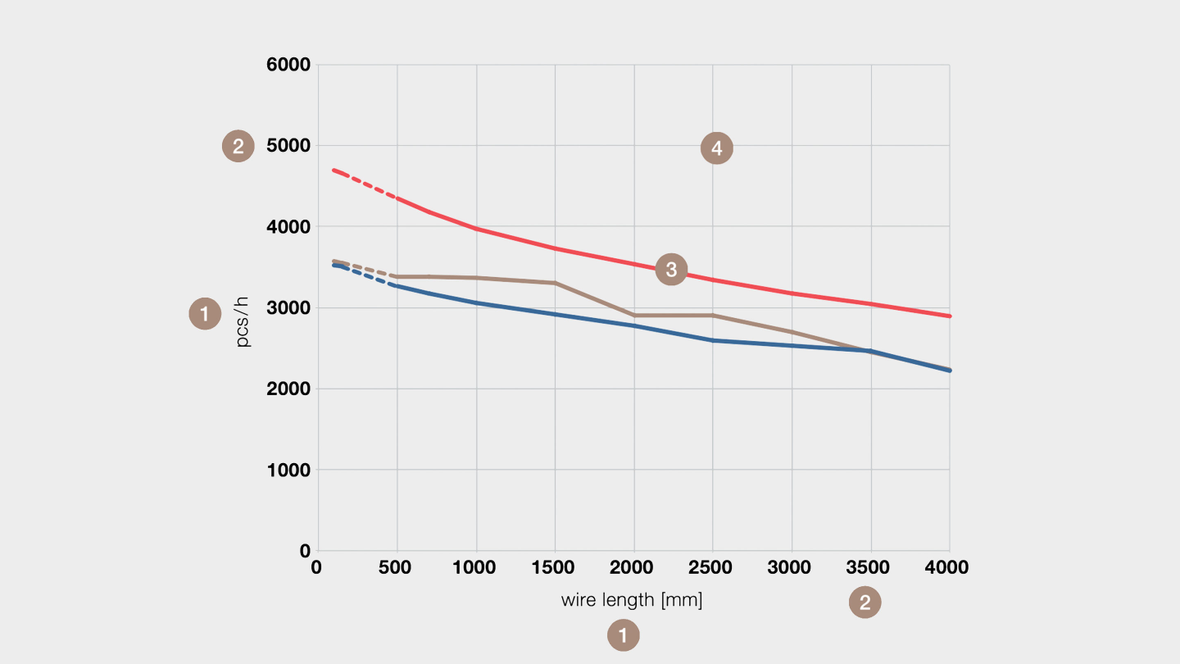
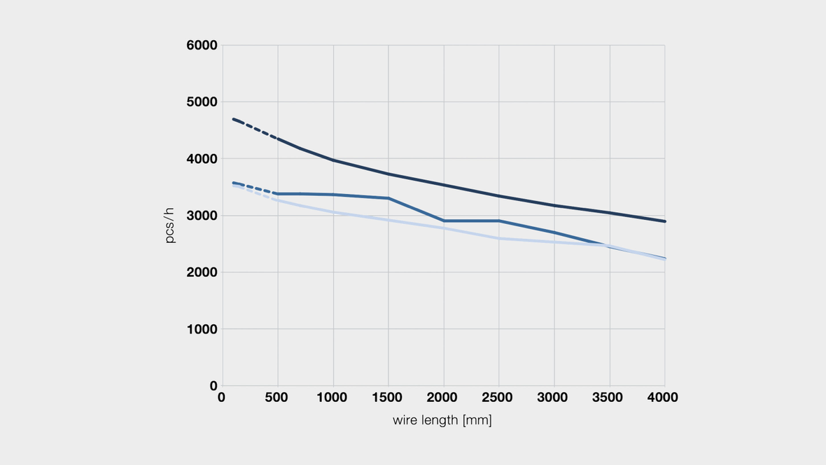
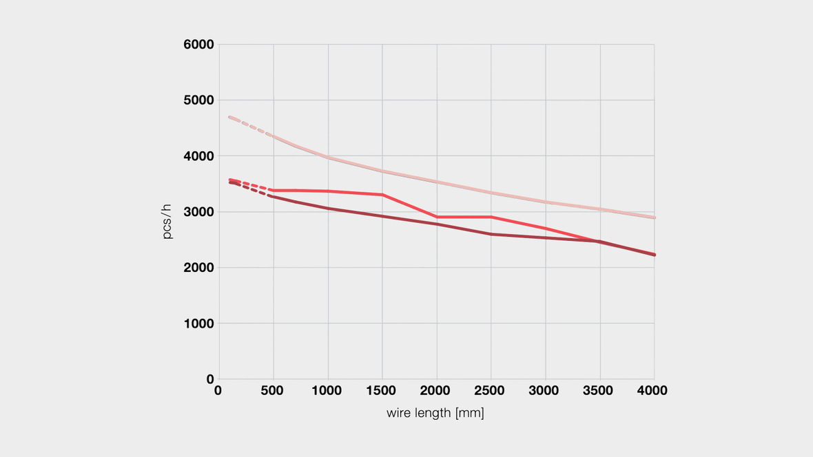
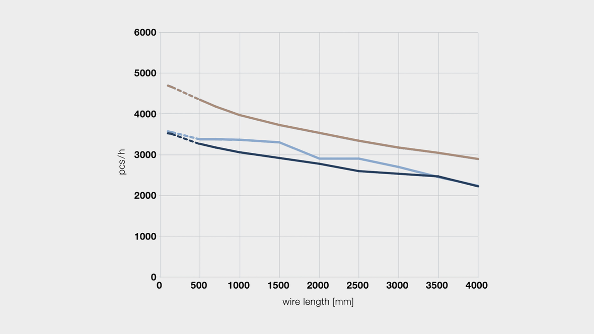
Lines are used to connect related values, thereby referencing their development. Several lines can be compared easily. For quick reference, the lines are placed over a grid. Apply colors from the secondary palette to strengthen the link with the brand identity and make sure that there is sufficient contrast between the individual lines. Retain the overall relation of the elements when scaling the tables up or down.
- Names of axes Helvetica Neue Light, 6.5/8 pt, black
- Labels of axes Helvetica Neue Bold, 6.5/8 pt, black
- Lines 1 pt solid or dotted, corporate design colors
- Grid 0.25 pt solid, light gray
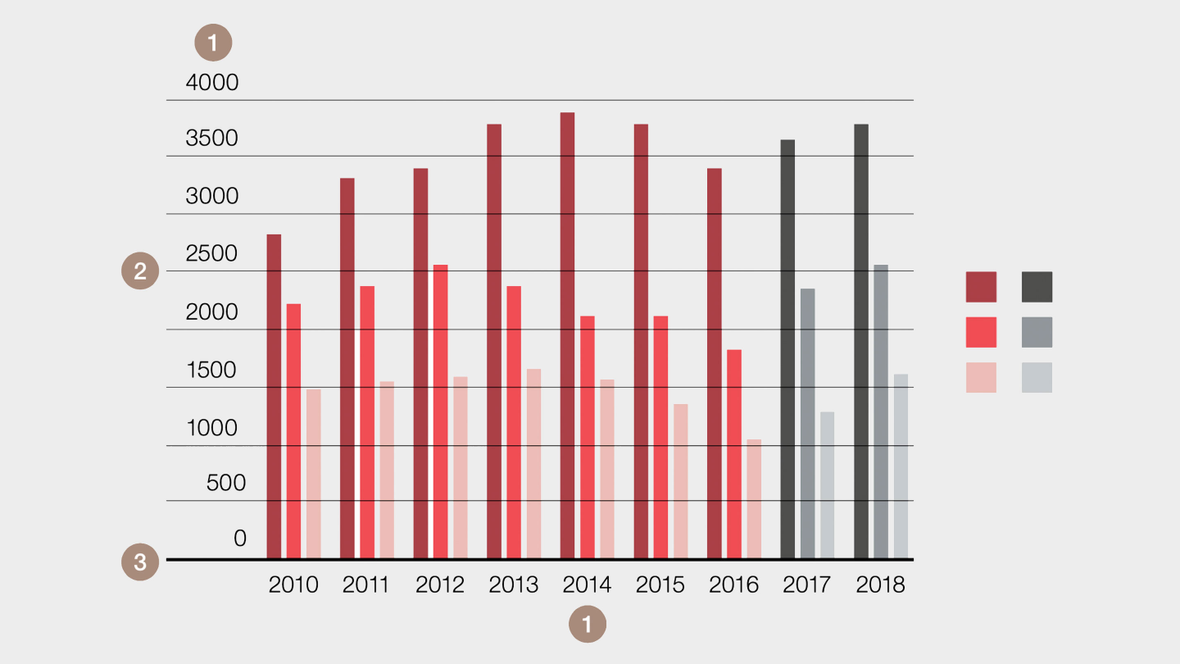
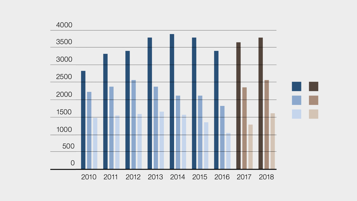
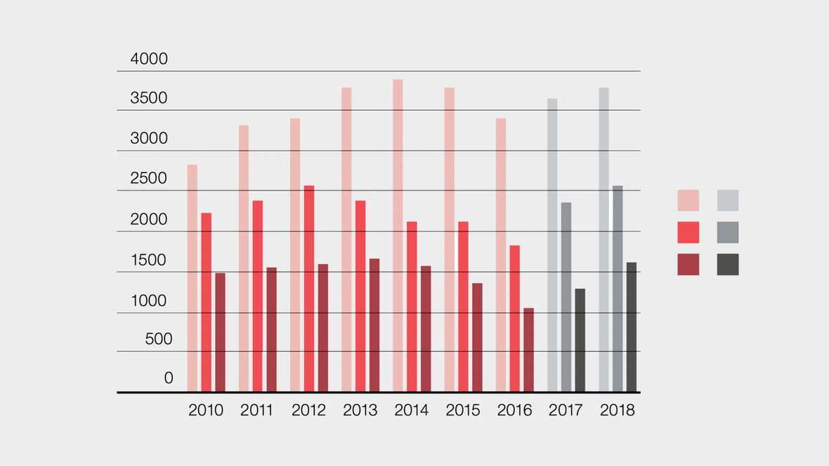
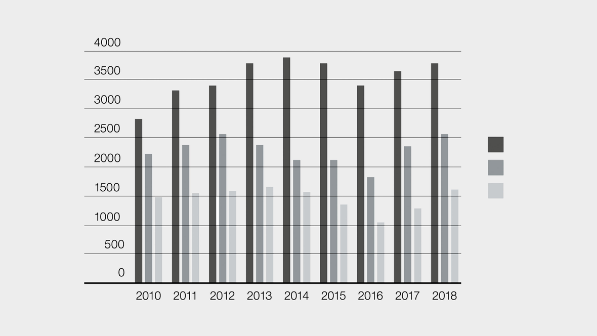
This type of chart uses mostly vertical bars of varying heights to show comparisons between categories of data. Horizontal lines are added for increased user friendliness. Apply colors from the brand palette and try to limit them to two per chart. Different shades will provide the required number of colors. Make sure that you retain the overall relation of the elements when scaling the tables up or down.
- Labels of axes Helvetica Neue Light, 6.5/8 pt, black
- Guides1 pt solid, black
- Base line0.25 pt solid, black
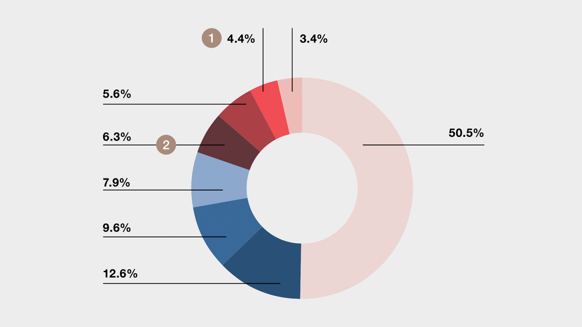
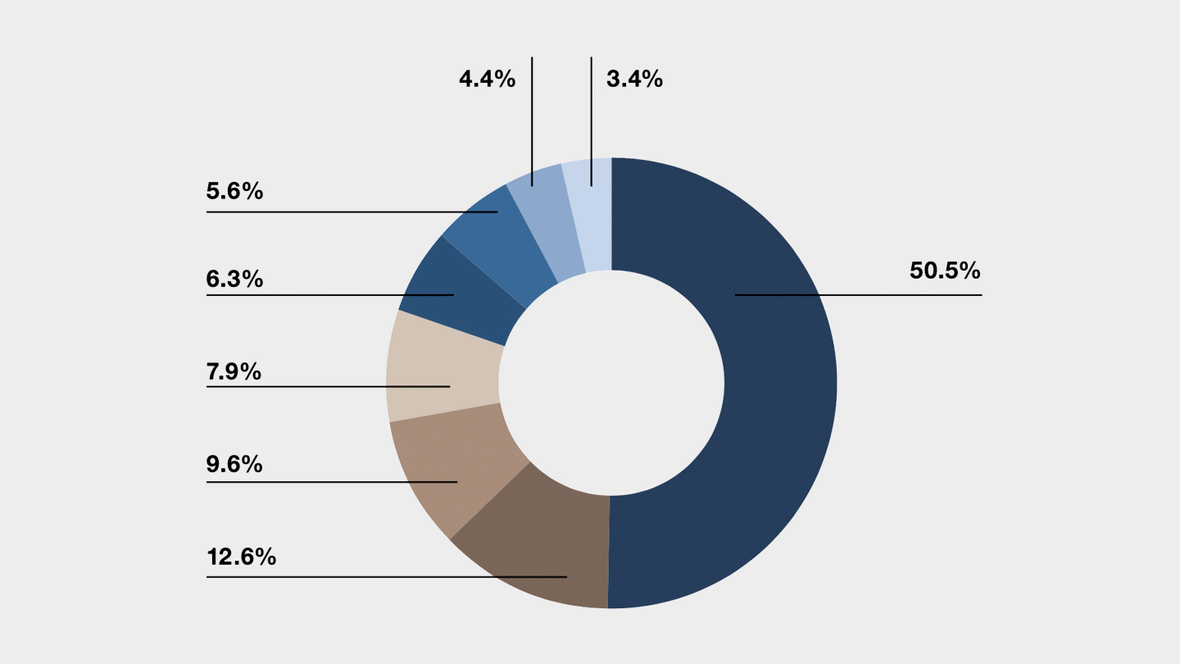
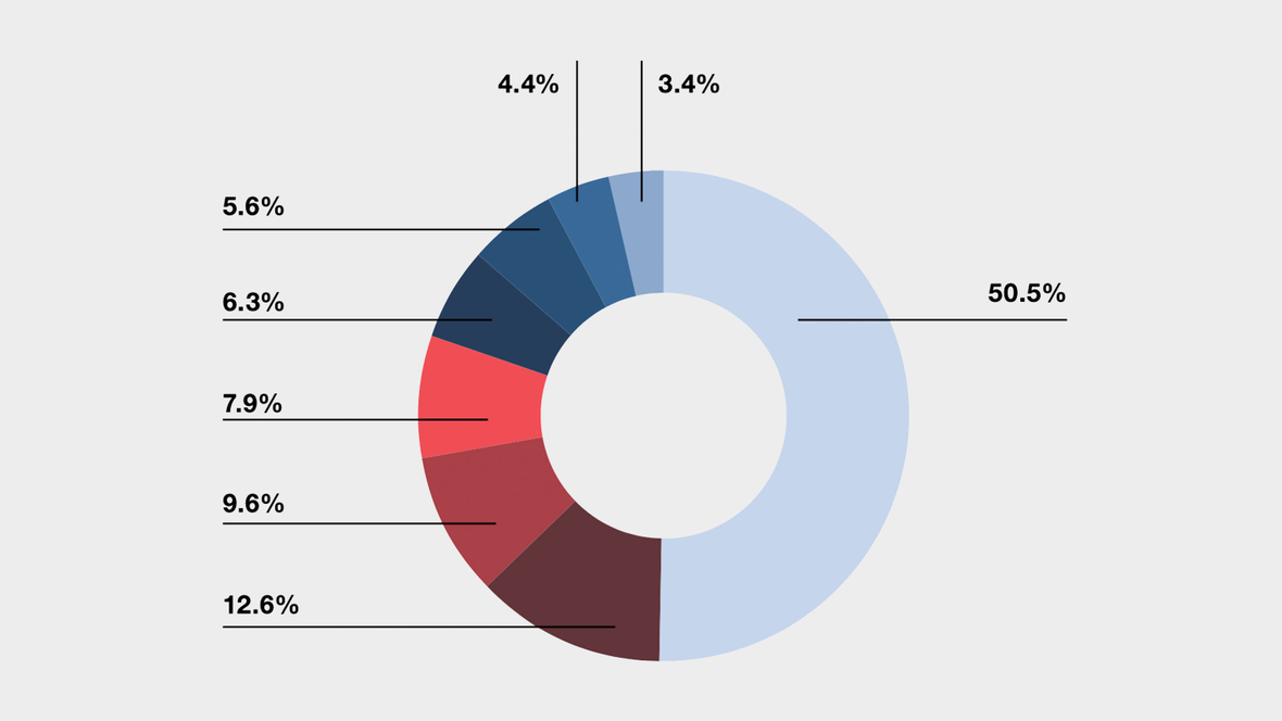
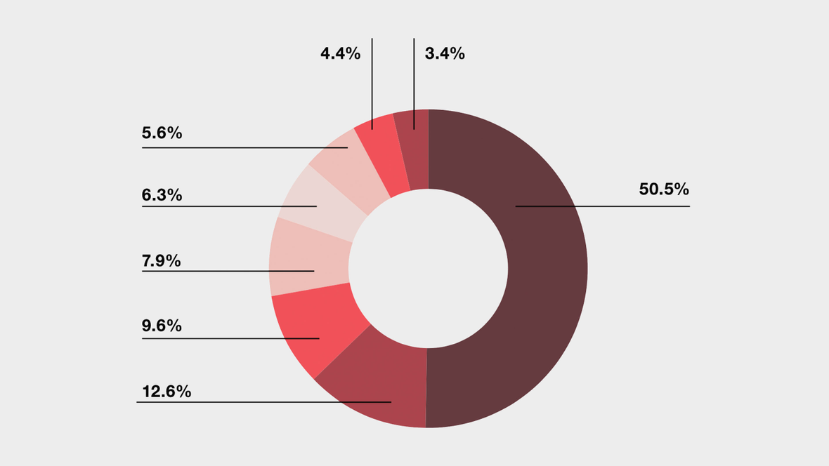
This chart is a circular statistical graphic which is divided into slices to illustrate numerical proportions. The diameter of the inner circle is half of the total diameter of the pie chart. Add the labels clockwise, starting at 12 o’clock. The values are linked to the slices with connectors. Apply colors from the brand palette and try to limit them to two per chart. Different shades will provide the required number of colors. Make sure that you retain the overall relation of the elements when scaling the tables up or down.
- LabelsHelvetica Neue Bold, 6.5/8 pt, black
- Connectors0.25 pt solid, black
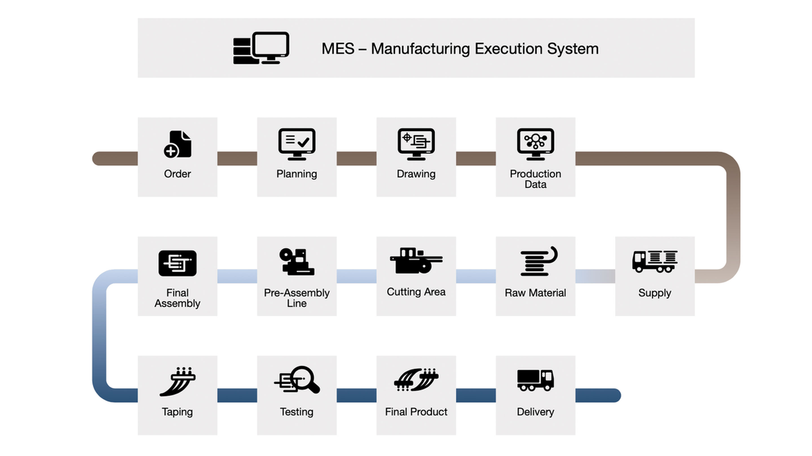
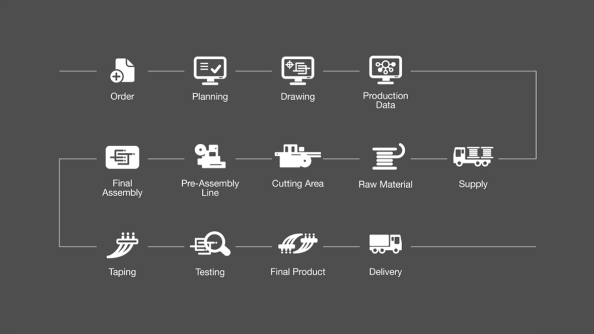
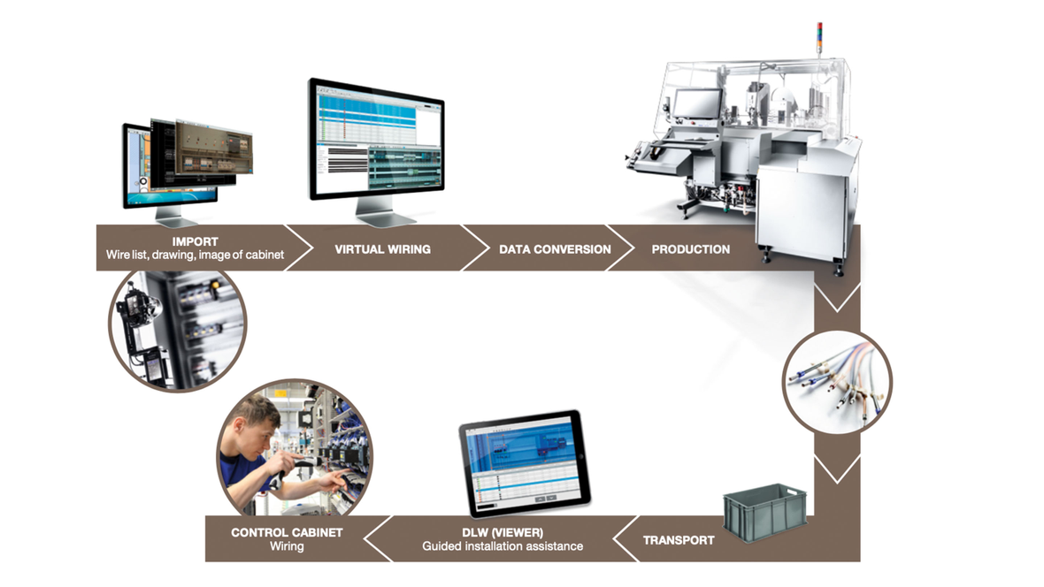
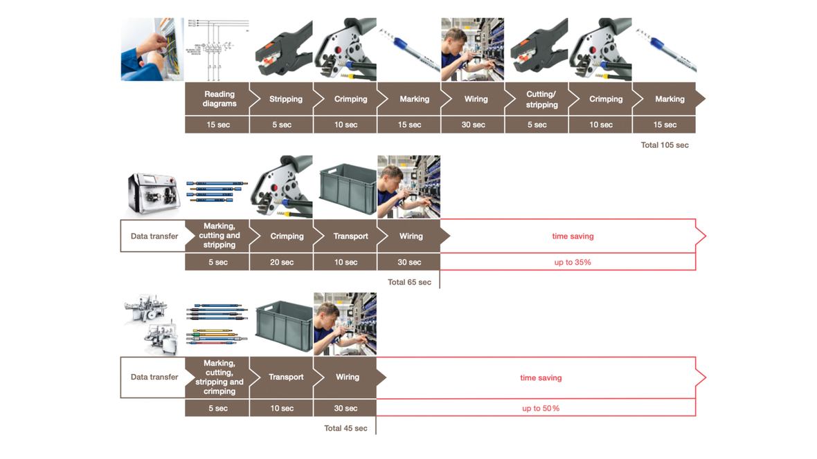
Such diagrams are used to demonstrate processes without the need for lengthy explanations. Icons or photographs may be linked. Process diagrams must be easy to follow. Apply colors from the brand palette. Mid copper is primarily used when photographs are inserted into the diagrams.
Processes and procedures can be illustrated schematically, as shown in these examples. The copper color serves as a merging element.
