Architecture
The personality of the Komax brand can be seen, felt and experienced in the architecture.
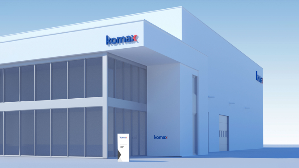
Greater distance
The two-color logo is always used for building lettering. Here, it is important to focus on both the greater-distance effect and the close-proximity effect. For greater-distance effect, the two-color logo is placed on a white background. The logo is an illuminated font made up of individually produced letters (no illuminated board). The logo is placed on walls and columns for close-proximity effect in outdoor areas. The single-color white logo is used on glass panes, doors and indoors.
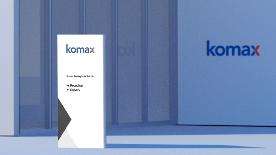
Short distance
All entrances are labeled with an outdoor panel or a column. The size of the board is adapted to the space available on the facade. The columns measure 80 cm × 180 cm.
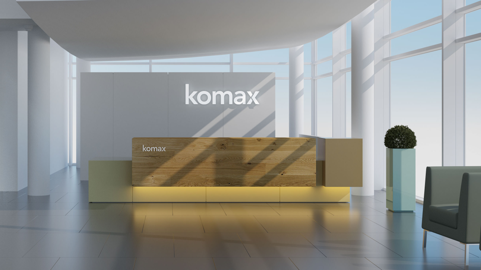
Reception
The reception area should be spacious, classy and inviting. The Komax logo is placed in white on a light wall behind the reception counter. The letters are backlit and are fitted with internal LEDs. They appear to float in front of the wall, since they are mounted with pins and at a slight distance from the wall. Depending on the material, the light gray logo is used on the reception counter. All interior colors are based on warm colors. This creates an inviting atmosphere.
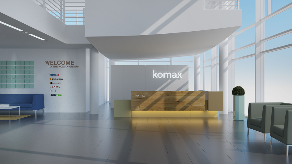
Welcome wall
Next to the three-dimensional logo, the product brands are presented in the following order: Komax, Schleuniger, adaptronic, Cirris, DiIT, WUSTEC.
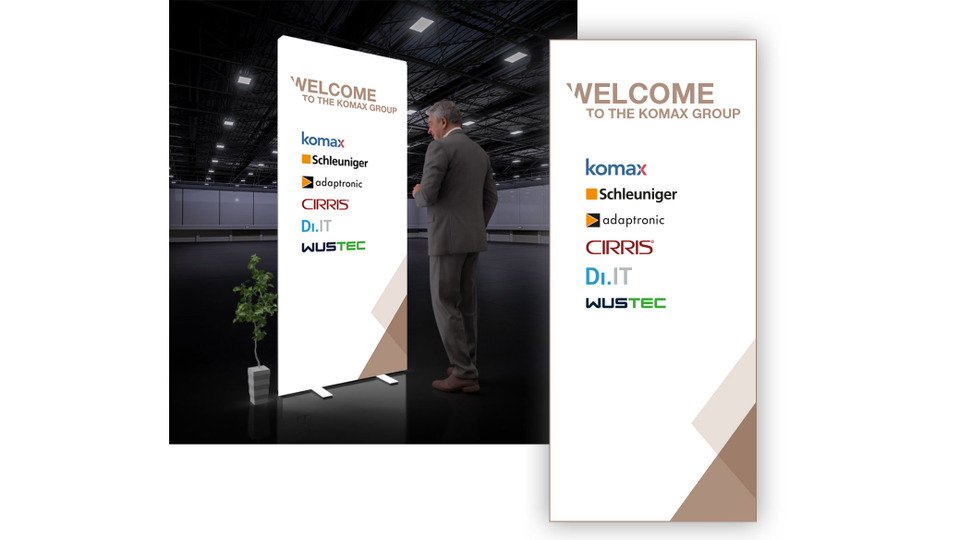
Freestanding board or roll-up
If there is no available wall space or the wall surface is not suitable for displaying logos, the product brands can be presented on a freestanding board or a “roll-up” banner.